
A problem in observational cosmology in the last decade has been the disagreement between WMAP and Planck, from the sky maps to cosmological parameters. A lot of papers have focused on the shift in cosmological parameters, especially considering Planck’s higher resolution allows access to many more multipoles than WMAP. When it comes to temperature though, it seems like the two experiments agree over the scales that both measure well.
In polarization, the story is a bit more complex. The Planck instrument had three official polarization releases (DR2, DR3, and DR4), each with a better handle on the low level processing. However, none of the releases constrained the gain sufficiently well, causing spurious large-scale polarized signals to be induced in the final maps.
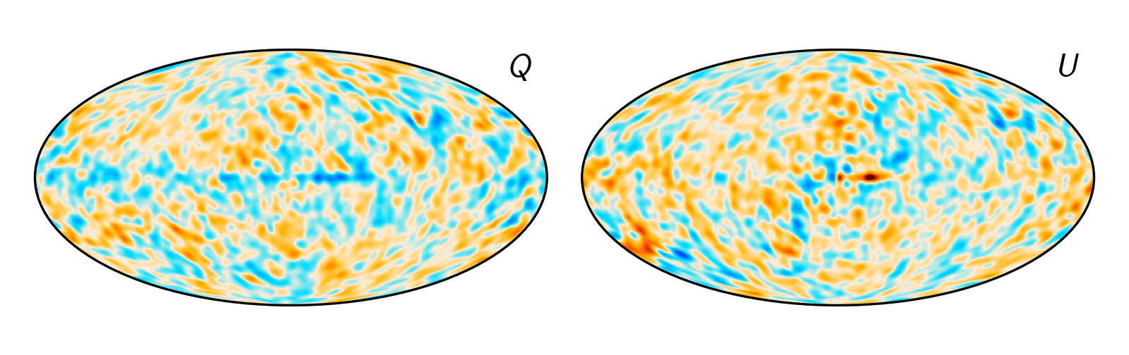
This is what it looked like when the Planck LFI PR3, and later on the PR4, took differences between the Planck 30 GHz map and WMAP K-band map. [1]
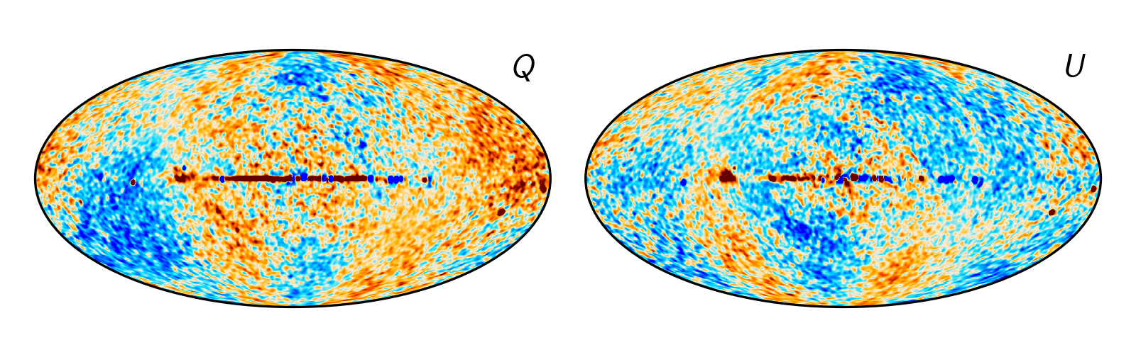
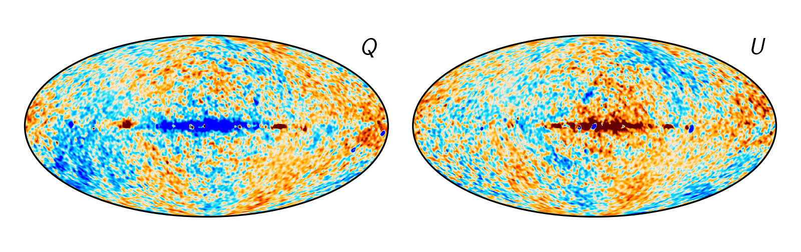
Not so good. There’s some clear residuals in both of them at large angular scales, where both experiments should have similar sensitivities. It turns out that this signal can mostly be attributed to the uncertainties in the calibration in the LFI instrument. For reference, here is the expected signal from incorrect relative gain, presented in Planck PR3. [2]

The BeyondPlanck project took a global, iterative approach to the LFI problem, by solving for a sky model and calibrating the instrument off of that sky model several thousand times, allowing us both to get a better answer, but also do full propagation of error for free. To actually do this, the three LFI bands (30, 44, and 70 GHz) weren’t sufficient to constrain the sky model, and WMAP maps close to those bands (Ka, Q, and V) were used to stabilize the model. It was, to my knowledge, a novel way of creating a pipeline, making a sky model that depended on external data, and characterizing the low-level data based on it.
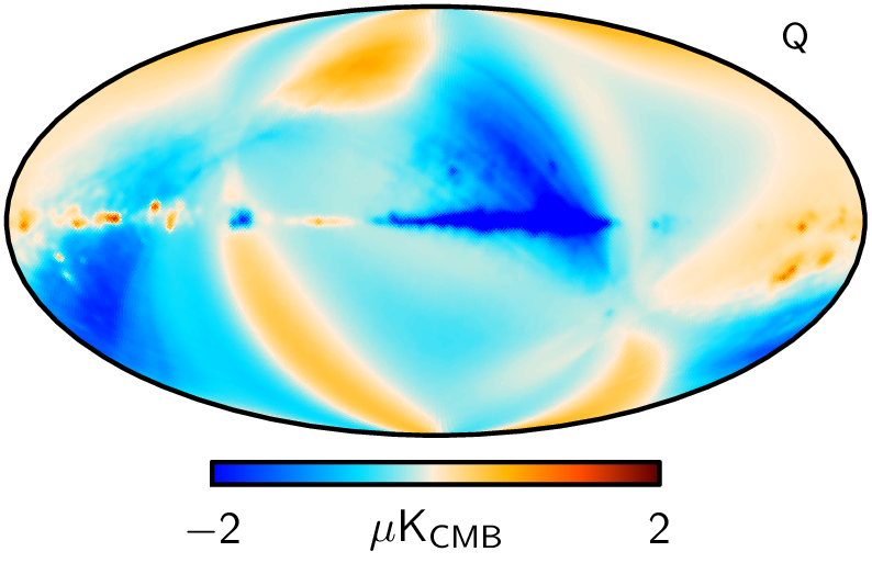
When you add external data, you have to be careful, because instrumental effects can sneak in and be misinterpreted. In the case of WMAP, this came in the form of the poorly measured modes, artifacts from the scanning strategy of the instrument that LFI didn’t have to deal with. The most famous artifacts here are spurious large-scale polarization signals that in some cases are the dominant signal. Since the WMAP team had a pretty good idea of where they came from, they released low-resolution covariance matrices to try and downweight these large-scale signals. In the BeyondPlanck analysis, this is precisely how we used the polarization maps, reducing them to low resolution and using the covariance matrices whenever evaluating the sky model.
Now, the poorly measured modes are interesting, because they came from uncertainty in various parameters propagated through to polarized maps. If we did the same thing for WMAP as we did for LFI, could we marginalize over the uncertainty of the instrumental parameters, and perhaps get sky maps without the poorly measured modes? Better yet, could we use the same code that we used for LFI to do that, cutting out years of work?
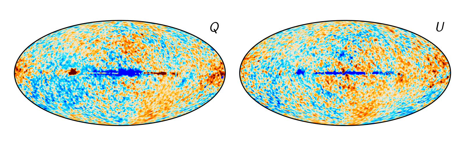
This was basically the result of the two papers I led, Watts et al. 2023a and 2023b. [3,4] In 2023a, I took the Q-band maps as a case study, just seeing what kind of architecture we would need to use and create to get this analysis going. In it, we went through all the details, like how we had to do the differential mapmaking, how sampling of the transmission imbalance parameters worked, and if the maps actually agreed in the end. In this, we found two very cool results. First, I found that pickup from the far sidelobes could mimic the poorly measured modes – this was a totally new result, and we pushed the paper’s publication back several times just to make sure we didn't mess this up somehow. Second, the maps we created didn’t have the poorly measured modes in them at all! We showed that sampling all parameters jointly actually allowed us to create maps that deviated from the true sky just at the expected level of white noise.
With this proof of concept in hand, we started a new analysis in 2023b, where we actually did the full modeling of the sky jointly with Planck LFI and WMAP TOD analysis. At some level, this was going to be a simple generalization of BeyondPlanck – we were using all the same data, plus K-band and W-band from WMAP, just processed at the same time, starting from the raw data.

In my opinion, the most important product of this analysis is the frequency maps from LFI and WMAP. In this joint framework, we take into account that the maps from each frequency are attempting to measure the same sky at different frequencies, allowing for the sky at one frequency to indirectly tell us how close another map is to the other answer. Overall, these maps are the closest LFI and WMAP have ever come towards being consistent with each other. At some level, this had to be the case, because of the pipeline.
It gets to an interesting philosophical question – how do we know if these maps are correct? Or maybe, how do we know these maps are “more” correct than the fiducial analyses? One argument for this is that we can fit a better sky model to them, and the maps are consistent with each other with very little post-processing. Taken together, these data create a fully coherent picture, with as simple a model as possible. Given a single model’s framework, we should be able to fit everything into the model without too many unreasonable adjustments, or “epicycles”, if we want a throwback to Copernican times.
Comparing Cosmoglobe maps is not such a fair comparison, since the maps were created “knowing” about each other. So let’s consider a different comparison, W-band versus Planck 100 GHz, the lowest frequency map on HFI.
These maps didn’t know anything about each other during processing, and yet they agree within the white noise level. Any concerns about correlations and nuisance parameters should be somewhat reduced upon seeing this.
There’s obviously a lot more to do. We limited ourselves here, partly to just see what the effects might be of adding a single dataset, turning one knob at a time. Maybe we should be thinking a bit more about the HFI maps, and how this would affect our sky model and hence the maps we get out.
I think the big lesson here though was that the data analysis actually became easier when we included the sky model. It made it easier to see what instrumental effects we hadn’t modeled, what the effect of changing the sky model had on the actual frequency maps, and just let us play around more. And there’s a lot of fun to be had! Stay tuned for a new paper about the new AME model we had to use for this analysis!